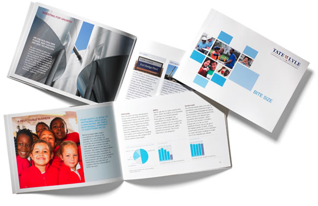
Tate & Lyle: Bite Size
The ask
Big is not always better. Take the Annual Report, for example; a daunting read at the best of times. Tate & Lyle understood this and asked us to design a more compact version, imparting the same strategic information and key facts and figures, but to be much more accessible to its staff around the world.
The task
We designed this succinct document – entitled ‘Bite Size’ – to retain the look and feel of the official Annual Report, whilst incorporating subtle design features to make the most of its reduced size. We chose an A5 landscape format, to maximise the clarity of text, charts and images, as these dimensions provided for greater width from the paper’s edge to the gutter. A more discreet selection of colours from Tate & Lyle’s colour palette was employed, as was careful use of borders, shading and highlighting, to ensure complete legibility across all 32 pages, whilst remaining true to the Tate & Lyle brand guidelines.
The proof
Senior staff at Tate & Lyle were pleasantly surprised that we had managed to convey so much vital information so clearly across such a small area, and reported that the feedback from staff around the globe was positive. So good things really do come in small packages.

